Custom Kitting Solutions
Read Case Study
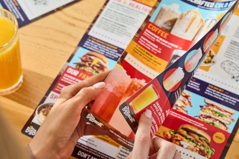
When a guest opens a menu, they take in an abundant amount of information. Their brains absorb far more than a list of food and prices, even if that’s all they actively process. They’re seeing dish names and descriptions, the colors, fonts, spacing, images, section headers, and dividers that accent the menu, and price placement. Each of these details affects how easy the menu is to read, what stands out first, and how a customer makes decisions.
The influence a menu has is not random luck. The psychology behind your menu is not a cheap parlor trick or an old wives’ tale. Menu engineering is backed by years of research into consumer behavior, decision-making, and purchasing patterns. Restaurants have long understood that the way a menu is organized can affect the guest experience and how much diners spend.
A menu should guide a guest through the ordering process, maybe even drawing their eyes to a pricier dish they may not have considered otherwise.
There’s a lot to cover, so let’s start from the top.
Although we’re starting from the top, your guests probably won’t. They’ll scan. Their eyes jump to the bolded section header, the boxed feature, the item with the most appetizing description, or the part of the page that feels easiest to process first. If a menu is too crowded or poorly organized, people are more likely to skip over items or fall back on the first familiar thing they see.
That’s why layout matters so much. Placement, spacing, and visual hierarchy help guide the guest’s attention before they’ve really started “reading” at all. If you want a customer to notice a signature dish or high-margin item, it needs to be positioned in a way that catches the eye naturally. And of course, even the strongest layout can lose its impact if the final menu printing comes out cramped, cluttered, or hard to follow.
Placement matters because not every part of a menu gets the same attention. Some areas naturally draw the eye first, whether that is a bold section header, a featured box, or an item with enough white space around it to stand apart from everything else. A customer may not realize it, but the layout is already nudging them toward certain dishes before they’ve even had the chance to read very much at all.
Designers use visual hierarchy to influence where your eyes immediately go. This is more of a general design principle rather than a rule specific to restaurant menus, but the same information still applies. Size, spacing, placement, and contrast all work together to make some items feel more important than others. If a restaurant wants to highlight a signature entrée, profitable add-on, or seasonal special, burying it in a crowded list isn’t going to help. Strong restaurant menu printing gives structure to the page, while custom menu printing gives restaurants more control over how those high-impact details actually come across.
Descriptions, spacing, and pricing all shape how a guest feels about an item once their eyes land on it. “Breakfast at Grandma’s” will grab someone’s attention and convey a feeling more than “Bacon and Eggs” will. A well-written description can make a dish sound more appealing, while clean spacing gives customers room to process what they are looking at without feeling overwhelmed. Pricing matters too. If prices are too bold, too large, or lined up in a way that draws more attention to cost than the food itself, guests may focus on the numbers before they focus on the meal. Which isn’t what you want.
That’s one reason restaurants often look for custom menu printing near them that can preserve spacing, pricing clarity, and overall readability. Even thoughtful menu design can lose its impact if the final print feels cramped, cluttered, or difficult to scan.
Too many choices may sound like a good problem to have, but they can slow customers down and make ordering feel more complicated than it needs to. When a menu is packed with too many similar items, guests are more likely to skim past sections, second-guess themselves, or default to something safe and familiar just to make a decision. That doesn’t always lead to the sale the restaurant hoped for.
A focused menu with a clear layout helps customers have a seamless dining experience and helps your restaurant to be profitable. Grouping items clearly, trimming unnecessary overlap, and giving each section room to breathe makes the menu easier to navigate. Even the best menu printing can’t fix a menu that asks guests to sort through too much at once.
A well-designed menu should do two things at once: help guests make decisions easily and reflect the kind of experience your restaurant wants to create. Every choice on the page, from spacing and placement to typography and print quality, shapes how customers will remember your restaurant before they ever take a bite of your food.
When the layout is printed clearly and consistently, it’s easier for guests to navigate and easier for your brand to make the right impression. If you’re trying to bring all of these details together, you can trust a custom menu printing company near you to help handle the process and come out on the other side with a menu that works for both your customers and your brand.